Showing posts with label multivariate analysis. Show all posts

The China Study II: Does calorie restriction increase longevity?

The idea that calorie restriction extends human life comes largely from studies of other species. The most relevant of those studies have been conducted with primates, where it has been shown that primates that eat a restricted calorie diet live longer and healthier lives than those that are allowed to eat as much as they want.

There are two main problems with many of the animal studies of calorie restriction. One is that, as natural lifespan decreases, it becomes progressively easier to experimentally obtain major relative lifespan extensions. (That is, it seems much easier to double the lifespan of an organism whose natural lifespan is one day than an organism whose natural lifespan is 80 years.) The second, and main problem in my mind, is that the studies often compare obese with lean animals.

Obesity clearly reduces lifespan in humans, but that is a different claim than the one that calorie restriction increases lifespan. It has often been claimed that Asian countries and regions where calorie intake is reduced display increased lifespan. And this may well be true, but the question remains as to whether this is due to calorie restriction increasing lifespan, or because the rates of obesity are much lower in countries and regions where calorie intake is reduced.

So, what can the China Study II data tell us about the hypothesis that calorie restriction increases longevity?

As it turns out, we can conduct a preliminary test of this hypothesis based on a key assumption. Let us say we compared two populations (e.g., counties in China), based on the following ratio: number of deaths at or after age 70 divided by number deaths before age 70. Let us call this the “ratio of longevity” of a population, or RLONGEV. The assumption is that the population with the highest RLONGEV would be the population with the highest longevity of the two. The reason is that, as longevity goes up, one would expect to see a shift in death patterns, with progressively more people dying old and fewer people dying young.

The 1989 China Study II dataset has two variables that we can use to estimate RLONGEV. They are coded as M005 and M006, and refer to the mortality rates from 35 to 69 and 70 to 79 years of age, respectively. Unfortunately there is no variable for mortality after 79 years of age, which limits the scope of our results somewhat. (This does not totally invalidate the results because we are using a ratio as our measure of longevity, not the absolute number of deaths from 70 to 79 years of age.) Take a look at these two previous China Study II posts (here, and here) for other notes, most of which apply here as well. The notes are at the end of the posts.

All of the results reported here are from analyses conducted using WarpPLS. Below is a model with coefficients of association; it is a simple model, since the hypothesis that we are testing is also simple. (Click on it to enlarge. Use the "CRTL" and "+" keys to zoom in, and CRTL" and "-" to zoom out.) The arrows explore associations between variables, which are shown within ovals. The meaning of each variable is the following: TKCAL = total calorie intake per day; RLONGEV = ratio of longevity; SexM1F2 = sex, with 1 assigned to males and 2 to females.


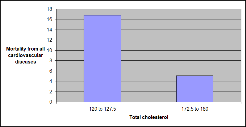
As one would expect, being female is associated with increased longevity, but the association is just shy of being statistically significant in this dataset (beta=0.14; P=0.07). The association between total calorie intake and longevity is trivial, and statistically indistinguishable from zero (beta=-0.04; P=0.39). Moreover, even though this very weak association is overall negative (or inverse), the sign of the association here does not fully reflect the shape of the association. The shape is that of an inverted J-curve; a.k.a. U-curve. When we split the data into total calorie intake terciles we get a better picture:


The second tercile, which refers to a total daily calorie intake of 2193 to 2844 calories, is the one associated with the highest longevity. The first tercile (with the lowest range of calories) is associated with a higher longevity than the third tercile (with the highest range of calories). These results need to be viewed in context. The average weight in this dataset was about 116 lbs. A conservative estimate of the number of calories needed to maintain this weight without any physical activity would be about 1740. Add about 700 calories to that, for a reasonable and healthy level of physical activity, and you get 2440 calories needed daily for weight maintenance. That is right in the middle of the second tercile.

In simple terms, the China Study II data seems to suggest that those who eat well, but not too much, live the longest. Those who eat little have slightly lower longevity. Those who eat too much seem to have the lowest longevity, perhaps because of the negative effects of excessive body fat.

Because these trends are all very weak from a statistical standpoint, we have to take them with caution. What we can say with more confidence is that the China Study II data does not seem to support the hypothesis that calorie restriction increases longevity.

Reference

Kock, N. (2010). WarpPLS 1.0 User Manual. Laredo, Texas: ScriptWarp Systems.

Notes

- The path coefficients (indicated as beta coefficients) reflect the strength of the relationships; they are a bit like standard univariate (or Pearson) correlation coefficients, except that they take into consideration multivariate relationships (they control for competing effects on each variable). Whenever nonlinear relationships were modeled, the path coefficients were automatically corrected by the software to account for nonlinearity.

- Only two data points per county were used (for males and females). This increased the sample size of the dataset without artificially reducing variance, which is desirable since the dataset is relatively small (each county, not individual, is a separate data point is this dataset). This also allowed for the test of commonsense assumptions (e.g., the protective effects of being female), which is always a good idea in a multivariate analyses because violation of commonsense assumptions may suggest data collection or analysis error. On the other hand, it required the inclusion of a sex variable as a control variable in the analysis, which is no big deal.

- Mortality from schistosomiasis infection (MSCHIST) does not confound the results presented here. Only counties where no deaths from schistosomiasis infection were reported have been included in this analysis. The reason for this is that mortality from schistosomiasis infection can severely distort the results in the age ranges considered here. On the other hand, removal of counties with deaths from schistosomiasis infection reduced the sample size, and thus decreased the statistical power of the analysis.

The China Study II: Wheat flour, rice, and cardiovascular disease

In my last post on the China Study II, I analyzed the effect of total and HDL cholesterol on mortality from all cardiovascular diseases. The main conclusion was that total and HDL cholesterol were protective. Total and HDL cholesterol usually increase with intake of animal foods, and particularly of animal fat. The lowest mortality from all cardiovascular diseases was in the highest total cholesterol range, 172.5 to 180; and the highest mortality in the lowest total cholesterol range, 120 to 127.5. The difference was quite large; the mortality in the lowest range was approximately 3.3 times higher than in the highest.

This post focuses on the intake of two main plant foods, namely wheat flour and rice intake, and their relationships with mortality from all cardiovascular diseases. After many exploratory multivariate analyses, wheat flour and rice emerged as the plant foods with the strongest associations with mortality from all cardiovascular diseases. Moreover, wheat flour and rice have a strong and inverse relationship with each other, which suggests a “consumption divide”. Since the data is from China in the late 1980s, it is likely that consumption of wheat flour is even higher now. As you’ll see, this picture is alarming.

The main model and results

All of the results reported here are from analyses conducted using WarpPLS. Below is the model with the main results of the analyses. (Click on it to enlarge. Use the "CRTL" and "+" keys to zoom in, and CRTL" and "-" to zoom out.) The arrows explore associations between variables, which are shown within ovals. The meaning of each variable is the following: SexM1F2 = sex, with 1 assigned to males and 2 to females; MVASC = mortality from all cardiovascular diseases (ages 35-69); TKCAL = total calorie intake per day; WHTFLOUR = wheat flour intake (g/day); and RICE = and rice intake (g/day).


The variables to the left of MVASC are the main predictors of interest in the model. The one to the right is a control variable – SexM1F2. The path coefficients (indicated as beta coefficients) reflect the strength of the relationships. A negative beta means that the relationship is negative; i.e., an increase in a variable is associated with a decrease in the variable that it points to. The P values indicate the statistical significance of the relationship; a P lower than 0.05 generally means a significant relationship (95 percent or higher likelihood that the relationship is “real”).

In summary, the model above seems to be telling us that:

- As rice intake increases, wheat flour intake decreases significantly (beta=-0.84; P<0.01). This relationship would be the same if the arrow pointed in the opposite direction. It suggests that there is a sharp divide between rice-consuming and wheat flour-consuming regions.

- As wheat flour intake increases, mortality from all cardiovascular diseases increases significantly (beta=0.32; P<0.01). This is after controlling for the effects of rice and total calorie intake. That is, wheat flour seems to have some inherent properties that make it bad for one’s health, even if one doesn’t consume that many calories.

- As rice intake increases, mortality from all cardiovascular diseases decreases significantly (beta=-0.24; P<0.01). This is after controlling for the effects of wheat flour and total calorie intake. That is, this effect is not entirely due to rice being consumed in place of wheat flour. Still, as you’ll see later in this post, this relationship is nonlinear. Excessive rice intake does not seem to be very good for one’s health either.

- Increases in wheat flour and rice intake are significantly associated with increases in total calorie intake (betas=0.25, 0.33; P<0.01). This may be due to wheat flour and rice intake: (a) being themselves, in terms of their own caloric content, main contributors to the total calorie intake; or (b) causing an increase in calorie intake from other sources. The former is more likely, given the effect below.

- The effect of total calorie intake on mortality from all cardiovascular diseases is insignificant when we control for the effects of rice and wheat flour intakes (beta=0.08; P=0.35). This suggests that neither wheat flour nor rice exerts an effect on mortality from all cardiovascular diseases by increasing total calorie intake from other food sources.

- Being female is significantly associated with a reduction in mortality from all cardiovascular diseases (beta=-0.24; P=0.01). This is to be expected. In other words, men are women with a few design flaws, so to speak. (This situation reverses itself a bit after menopause.)

Wheat flour displaces rice

The graph below shows the shape of the association between wheat flour intake (WHTFLOUR) and rice intake (RICE). The values are provided in standardized format; e.g., 0 is the mean (a.k.a. average), 1 is one standard deviation above the mean, and so on. The curve is the best-fitting U curve obtained by the software. It actually has the shape of an exponential decay curve, which can be seen as a section of a U curve. This suggests that wheat flour consumption has strongly displaced rice consumption in several regions in China, and also that wherever rice consumption is high wheat flour consumption tends to be low.


As wheat flour intake goes up, so does cardiovascular disease mortality

The graphs below show the shapes of the association between wheat flour intake (WHTFLOUR) and mortality from all cardiovascular diseases (MVASC). In the first graph, the values are provided in standardized format; e.g., 0 is the mean (or average), 1 is one standard deviation above the mean, and so on. In the second graph, the values are provided in unstandardized format and organized in terciles (each of three equal intervals).


The curve in the first graph is the best-fitting U curve obtained by the software. It is a quasi-linear relationship. The higher the consumption of wheat flour in a county, the higher seems to be the mortality from all cardiovascular diseases. The second graph suggests that mortality in the third tercile, which represents a consumption of wheat flour of 501 to 751 g/day (a lot!), is 69 percent higher than mortality in the first tercile (0 to 251 g/day).

Rice seems to be protective, as long as intake is not too high

The graphs below show the shapes of the association between rice intake (RICE) and mortality from all cardiovascular diseases (MVASC). In the first graph, the values are provided in standardized format. In the second graph, the values are provided in unstandardized format and organized in terciles.


Here the relationship is more complex. The lowest mortality is clearly in the second tercile (206 to 412 g/day). There is a lot of variation in the first tercile, as suggested by the first graph with the U curve. (Remember, as rice intake goes down, wheat flour intake tends to go up.) The U curve here looks similar to the exponential decay curve shown earlier in the post, for the relationship between rice and wheat flour intake.

In fact, the shape of the association between rice intake and mortality from all cardiovascular diseases looks a bit like an “echo” of the shape of the relationship between rice and wheat flour intake. Here is what is creepy. This echo looks somewhat like the first curve (between rice and wheat flour intake), but with wheat flour intake replaced by “death” (i.e., mortality from all cardiovascular diseases).

What does this all mean?

- Wheat flour displacing rice does not look like a good thing. Wheat flour intake seems to have strongly displaced rice intake in the counties where it is heavily consumed. Generally speaking, that does not seem to have been a good thing. It looks like this is generally associated with increased mortality from all cardiovascular diseases.

- High glycemic index food consumption does not seem to be the problem here. Wheat flour and rice have very similar glycemic indices (but generally not glycemic loads; see below). Both lead to blood glucose and insulin spikes. Yet, rice consumption seems protective when it is not excessive. This is true in part (but not entirely) because it largely displaces wheat flour. Moreover, neither rice nor wheat flour consumption seems to be significantly associated with cardiovascular disease via an increase in total calorie consumption. This is a bit of a blow to the theory that high glycemic carbohydrates necessarily cause obesity, diabetes, and eventually cardiovascular disease.

- The problem with wheat flour is … hard to pinpoint, based on the results summarized here. Maybe it is the fact that it is an ultra-refined carbohydrate-rich food; less refined forms of wheat could be healthier. In fact, the glycemic loads of less refined carbohydrate-rich foods tend to be much lower than those of more refined ones. (Also, boiled brown rice has a glycemic load that is about three times lower than that of whole wheat bread; whereas the glycemic indices are about the same.) Maybe the problem is wheat flour's  gluten content. Maybe it is a combination of various factors, including these.

Reference

Kock, N. (2010). WarpPLS 1.0 User Manual. Laredo, Texas: ScriptWarp Systems.

Acknowledgment and notes

- Many thanks are due to Dr. Campbell and his collaborators for collecting and compiling the data used in this analysis. The data is from this site, created by those researchers to disseminate their work in connection with a study often referred to as the “China Study II”. It has already been analyzed by other bloggers. Notable analyses have been conducted by Ricardo at Canibais e Reis, Stan at Heretic, and Denise at Raw Food SOS.

- The path coefficients (indicated as beta coefficients) reflect the strength of the relationships; they are a bit like standard univariate (or Pearson) correlation coefficients, except that they take into consideration multivariate relationships (they control for competing effects on each variable). Whenever nonlinear relationships were modeled, the path coefficients were automatically corrected by the software to account for nonlinearity.

- The software used here identifies non-cyclical and mono-cyclical relationships such as logarithmic, exponential, and hyperbolic decay relationships. Once a relationship is identified, data values are corrected and coefficients calculated. This is not the same as log-transforming data prior to analysis, which is widely used but only works if the underlying relationship is logarithmic. Otherwise, log-transforming data may distort the relationship even more than assuming that it is linear, which is what is done by most statistical software tools.

- The R-squared values reflect the percentage of explained variance for certain variables; the higher they are, the better the model fit with the data. In complex and multi-factorial phenomena such as health-related phenomena, many would consider an R-squared of 0.20 as acceptable. Still, such an R-squared would mean that 80 percent of the variance for a particularly variable is unexplained by the data.

- The P values have been calculated using a nonparametric technique, a form of resampling called jackknifing, which does not require the assumption that the data is normally distributed to be met. This and other related techniques also tend to yield more reliable results for small samples, and samples with outliers (as long as the outliers are “good” data, and are not the result of measurement error).

- Only two data points per county were used (for males and females). This increased the sample size of the dataset without artificially reducing variance, which is desirable since the dataset is relatively small. This also allowed for the test of commonsense assumptions (e.g., the protective effects of being female), which is always a good idea in a complex analysis because violation of commonsense assumptions may suggest data collection or analysis error. On the other hand, it required the inclusion of a sex variable as a control variable in the analysis, which is no big deal.

- Since all the data was collected around the same time (late 1980s), this analysis assumes a somewhat static pattern of consumption of rice and wheat flour. In other words, let us assume that variations in consumption of a particular food do lead to variations in mortality. Still, that effect will typically take years to manifest itself. This is a major limitation of this dataset and any related analyses.

- Mortality from schistosomiasis infection (MSCHIST) does not confound the results presented here. Only counties where no deaths from schistosomiasis infection were reported have been included in this analysis. Mortality from all cardiovascular diseases (MVASC) was measured using the variable M059 ALLVASCc (ages 35-69). See this post for other notes that apply here as well.

The China Study II: Cholesterol seems to protect against cardiovascular disease

First of all, many thanks are due to Dr. Campbell and his collaborators for collecting and compiling the data used in this analysis. This data is from this site, created by those researchers to disseminate the data from a study often referred to as the “China Study II”. It has already been analyzed by other bloggers. Notable analyses have been conducted by Ricardo at Canibais e Reis, Stan at Heretic, and Denise at Raw Food SOS.

The analyses in this post differ from those other analyses in various aspects. One of them is that data for males and females were used separately for each county, instead of the totals per county. Only two data points per county were used (for males and females). This increased the sample size of the dataset without artificially reducing variance (for more details, see “Notes” at the end of the post), which is desirable since the dataset is relatively small. This also allowed for the test of commonsense assumptions (e.g., the protective effects of being female), which is always a good idea in a complex analysis because violation of commonsense assumption may suggest data collection or analysis error. On the other hand, it required the inclusion of a sex variable as a control variable in the analysis, which is no big deal.

The analysis was conducted using WarpPLS. Below is the model with the main results of the analysis. (Click on it to enlarge. Use the "CRTL" and "+" keys to zoom in, and CRTL" and "-" to zoom out.) The arrows explore associations between variables, which are shown within ovals. The meaning of each variable is the following: SexM1F2 = sex, with 1 assigned to males and 2 to females; HDLCHOL = HDL cholesterol; TOTCHOL = total cholesterol; MSCHIST = mortality from schistosomiasis infection; and MVASC = mortality from all cardiovascular diseases.


The variables to the left of MVASC are the main predictors of interest in the model – HDLCHOL and TOTCHOL. The ones to the right are control variables – SexM1F2 and MSCHIST. The path coefficients (indicated as beta coefficients) reflect the strength of the relationships. A negative beta means that the relationship is negative; i.e., an increase in a variable is associated with a decrease in the variable that it points to. The P values indicate the statistical significance of the relationship; a P lower than 0.05 generally means a significant relationship (95 percent or higher likelihood that the relationship is “real”).

In summary, this is what the model above is telling us:

- As HDL cholesterol increases, total cholesterol increases significantly (beta=0.48; P<0.01). This is to be expected, as HDL is a main component of total cholesterol, together with VLDL and LDL cholesterol.

- As total cholesterol increases, mortality from all cardiovascular diseases decreases significantly (beta=-0.25; P<0.01). This is to be expected if we assume that total cholesterol is in part an intervening variable between HDL cholesterol and mortality from all cardiovascular diseases. This assumption can be tested through a separate model (more below). Also, there is more to this story, as noted below.

- The effect of HDL cholesterol on mortality from all cardiovascular diseases is insignificant when we control for the effect of total cholesterol (beta=-0.08; P=0.26). This suggests that HDL’s protective role is subsumed by the variable total cholesterol, and also that it is possible that there is something else associated with total cholesterol that makes it protective. Otherwise the effect of total cholesterol might have been insignificant, and the effect of HDL cholesterol significant (the reverse of what we see here).

- Being female is significantly associated with a reduction in mortality from all cardiovascular diseases (beta=-0.16; P=0.01). This is to be expected. In other words, men are women with a few design flaws. (This situation reverses itself a bit after menopause.)

- Mortality from schistosomiasis infection is significantly and inversely associated with mortality from all cardiovascular diseases (beta=-0.28; P<0.01). This is probably due to those dying from schistosomiasis infection not being entered in the dataset as dying from cardiovascular diseases, and vice-versa.

Two other main components of total cholesterol, in addition to HDL cholesterol, are VLDL and LDL cholesterol. These are carried in particles, known as lipoproteins. VLDL cholesterol is usually represented as a fraction of triglycerides in cholesterol equations (e.g., the Friedewald and Iranian equations). It usually correlates inversely with HDL; that is, as HDL cholesterol increases, usually VLDL cholesterol decreases. Given this and the associations discussed above, it seems that LDL cholesterol is a good candidate for the possible “something else associated with total cholesterol that makes it protective”. But waidaminet! Is it possible that the demon particle, the LDL, serves any purpose other than giving us heart attacks?

The graph below shows the shape of the association between total cholesterol (TOTCHOL) and mortality from all cardiovascular diseases (MVASC). The values are provided in standardized format; e.g., 0 is the average, 1 is one standard deviation above the mean, and so on. The curve is the best-fitting S curve obtained by the software (an S curve is a slightly more complex curve than a U curve).


The graph below shows some of the data in unstandardized format, and organized differently. The data is grouped here in ranges of total cholesterol, which are shown on the horizontal axis. The lowest and highest ranges in the dataset are shown, to highlight the magnitude of the apparently protective effect. Here the two variables used to calculate mortality from all cardiovascular diseases (MVASC; see “Notes” at the end of this post) were added. Clearly the lowest mortality from all cardiovascular diseases is in the highest total cholesterol range, 172.5 to 180; and the highest mortality in the lowest total cholesterol range, 120 to 127.5. The difference is quite large; the mortality in the lowest range is approximately 3.3 times higher than in the highest.


The shape of the S-curve graph above suggests that there are other variables that are confounding the results a bit. Mortality from all cardiovascular diseases does seem to generally go down with increases in total cholesterol, but the smooth inflection point at the middle of the S-curve graph suggests a more complex variation pattern that may be influenced by other variables (e.g., smoking, dietary patterns, or even schistosomiasis infection; see “Notes” at the end of this post).

As mentioned before, total cholesterol is strongly influenced by HDL cholesterol, so below is the model with only HDL cholesterol (HDLCHOL) pointing at mortality from all cardiovascular diseases (MVASC), and the control variable sex (SexM1F2).


The graph above confirms the assumption that HDL’s protective role is subsumed by the variable total cholesterol. When the variable total cholesterol is removed from the model, as it was done above, the protective effect of HDL cholesterol becomes significant (beta=-0.27; P<0.01). The control variable sex (SexM1F2) was retained even in this targeted HDL effect model because of the expected confounding effect of sex; females generally tend to have higher HDL cholesterol and less cardiovascular disease than males.

Below, in the “Notes” section (after the “Reference”) are several notes, some of which are quite technical. Providing them separately hopefully has made the discussion above a bit easier to follow. The notes also point at some limitations of the analysis. This data needs to be analyzed from different angles, using multiple models, so that firmer conclusions can be reached. Still, the overall picture that seems to be emerging is at odds with previous beliefs based on the same dataset.

What could be increasing the apparently protective HDL and total cholesterol in this dataset? High consumption of animal foods, particularly foods rich in saturated fat and cholesterol, are strong candidates. Low consumption of vegetable oils rich in linoleic acid, and of foods rich in refined carbohydrates, are also good candidates. Maybe it is a combination of these.

We need more analyses!

Reference:

Kock, N. (2010). WarpPLS 1.0 User Manual. Laredo, Texas: ScriptWarp Systems.


Notes:

- The path coefficients (indicated as beta coefficients) reflect the strength of the relationships; they are a bit like standard univariate (or Pearson) correlation coefficients, except that they take into consideration multivariate relationships (they control for competing effects on each variable).

- The R-squared values reflect the percentage of explained variance for certain variables; the higher they are, the better the model fit with the data. In complex and multi-factorial phenomena such as health-related phenomena, many would consider an R-squared of 0.20 as acceptable. Still, such an R-squared would mean that 80 percent of the variance for a particularly variable is unexplained by the data.

- The P values have been calculated using a nonparametric technique, a form of resampling called jackknifing, which does not require the assumption that the data is normally distributed to be met. This and other related techniques also tend to yield more reliable results for small samples, and samples with outliers (as long as the outliers are “good” data, and are not the result of measurement error).

- Colinearity is an important consideration in models that analyze the effect of multiple predictors on one single variable. This is particularly true for multiple regression models, where there is a temptation of adding many predictors to the model to see which ones come out as the “winners”. This often backfires, as colinearity can severely distort the results. Some multiple regression techniques, such as automated stepwise regression with backward elimination, are particularly vulnerable to this problem. Colinearity is not the same as correlation, and thus is defined and measured differently. Two predictor variables may be significantly correlated and still have low colinearity. A reasonably reliable measure of colinearity is the variance inflation factor. Colinearity was tested in this model, and was found to be low.

- An effort was made here to avoid multiple data points per county (even though this was available for some variables), because this could artificially reduce the variance for each variable, and potentially bias the results. The reason for this is that multiple answers from a single county would normally be somewhat correlated; a higher degree of intra-county correlation than inter-county correlation. The resulting bias would be difficult to control for, via one or more control variables. With only two data points per county, one for males and the other for females, one can control for intra-country correlation by adding a “dummy” sex variable to the analysis, as a control variable. This was done here.

- Mortality from schistosomiasis infection (MSCHIST) is a variable that tends to affect the results in a way that makes it more difficult to make sense of them. Generally this is true for any infectious diseases that significantly affect a population under study. The problem with infection is that people with otherwise good health or habits may get the infection, and people with bad health and habits may not. Since cholesterol is used by the human body to fight disease, it may go up, giving the impression that it is going up for some other reason. Perhaps instead of controlling for its effect, as done here, it would have been better to remove from the analysis those counties with deaths from schistosomiasis infection. (See also this post, and this one.)

- Different parts of the data were collected at different times. It seems that the mortality data is for the period 1986-88, and the rest of the data is for 1989. This may have biased the results somewhat, even though the time lag is not that long, especially if there were changes in certain health trends from one period to the other. For example, major migrations from one county to another could have significantly affected the results.

- The following measures were used, from this online dataset like the other measures. P002 HDLCHOL, for HDLCHOL; P001 TOTCHOL, for TOTCHOL; and M021 SCHISTOc, for MSCHIST.

- SexM1F2 is a “dummy” variable that was coded with 1 assigned to males and 2 to females. As such, it essentially measures the “degree of femaleness” of the respondents. Being female is generally protective against cardiovascular disease, a situation that reverts itself a bit after menopause.

- MVASC is a composite measure of the two following variables, provided as component measures of mortality from all cardiovascular diseases: M058 ALLVASCb (ages 0-34), and M059 ALLVASCc (ages 35-69). A couple of obvious problems: (a) they does not include data on people older than 69; and (b) they seem to capture a lot of diseases, including some that do not seem like typical cardiovascular diseases. A factor analysis was conducted, and the loadings and cross-loadings suggested good validity. Composite reliability was also good. So essentially MVASC is measured here as a “latent variable” with two “indicators”. Why do this? The reason is that it reduces the biasing effects of incomplete data and measurement error (e.g., exclusion of folks older than 69). By the way, there is always some measurement error in any dataset.

- This note is related to measurement error in connection with the indicators for MVASC. There is something odd about the variables M058 ALLVASCb (ages 0-34), and M059 ALLVASCc (ages 35-69). According to the dataset, mortality from cardiovascular diseases for ages 0-34 is typically higher than for 35-69, for many counties. Given the good validity and reliability for MVASC as a latent variable, it is possible that the values for these two indicator variables were simply swapped by mistake.